Projects console
DASHBOARD
The projects console consists of all the projects created in the concerned space opened. The projects console consists of two sections, the left section is the list of projects of the space and the right section consists of the packs of the selected project. The selected project is depicted by blue selection color.
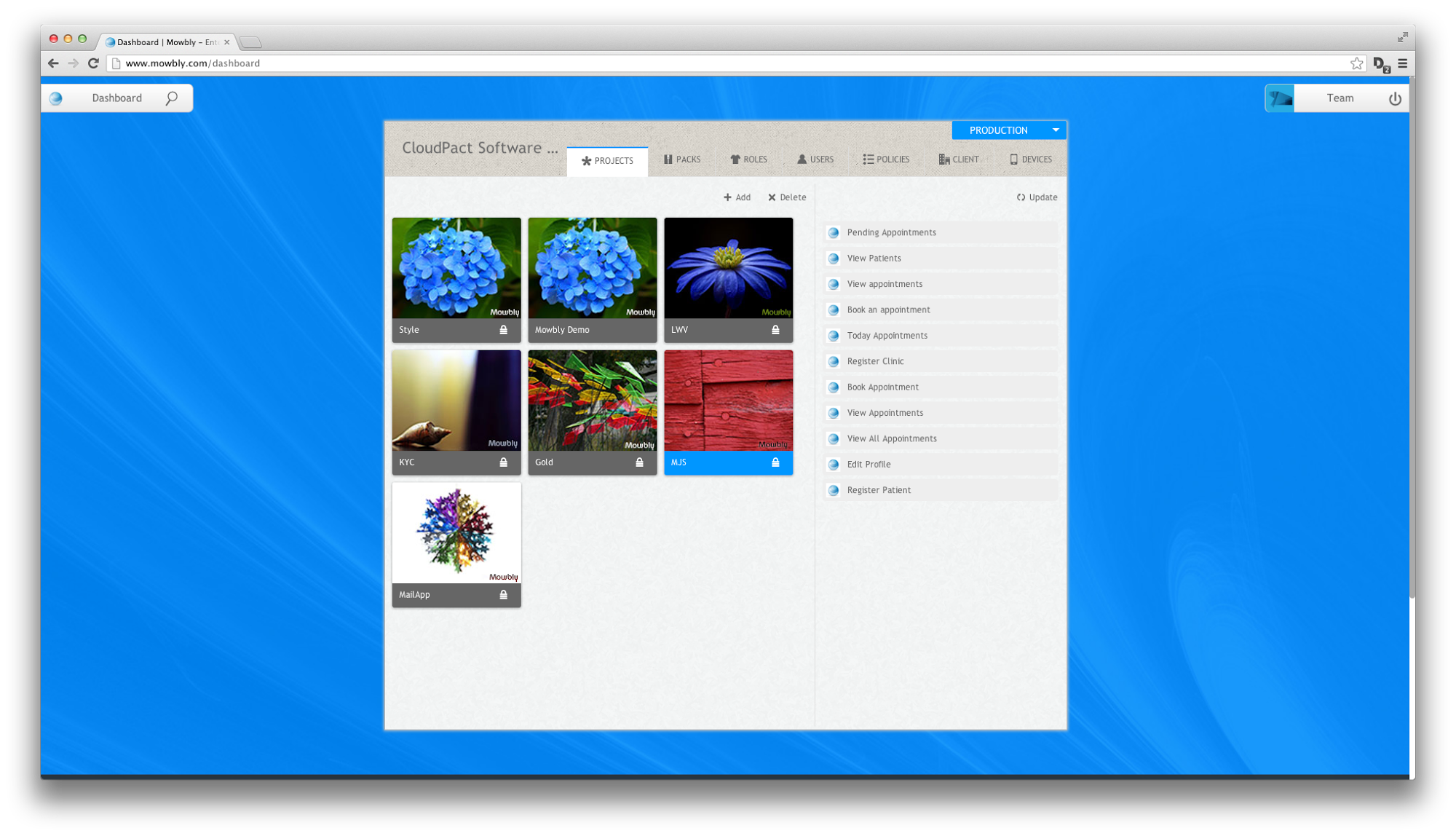
Fig 1 : Dashboard with the projects console open
Adding a project
You can add a project by clicking on the Add button present the left section of the projects console. On clicking the Add button the add project dialog drops down. Now, you can add a project name and click on the “Add” button to add the project.
Note: No two projects can have the same name inside the same space.
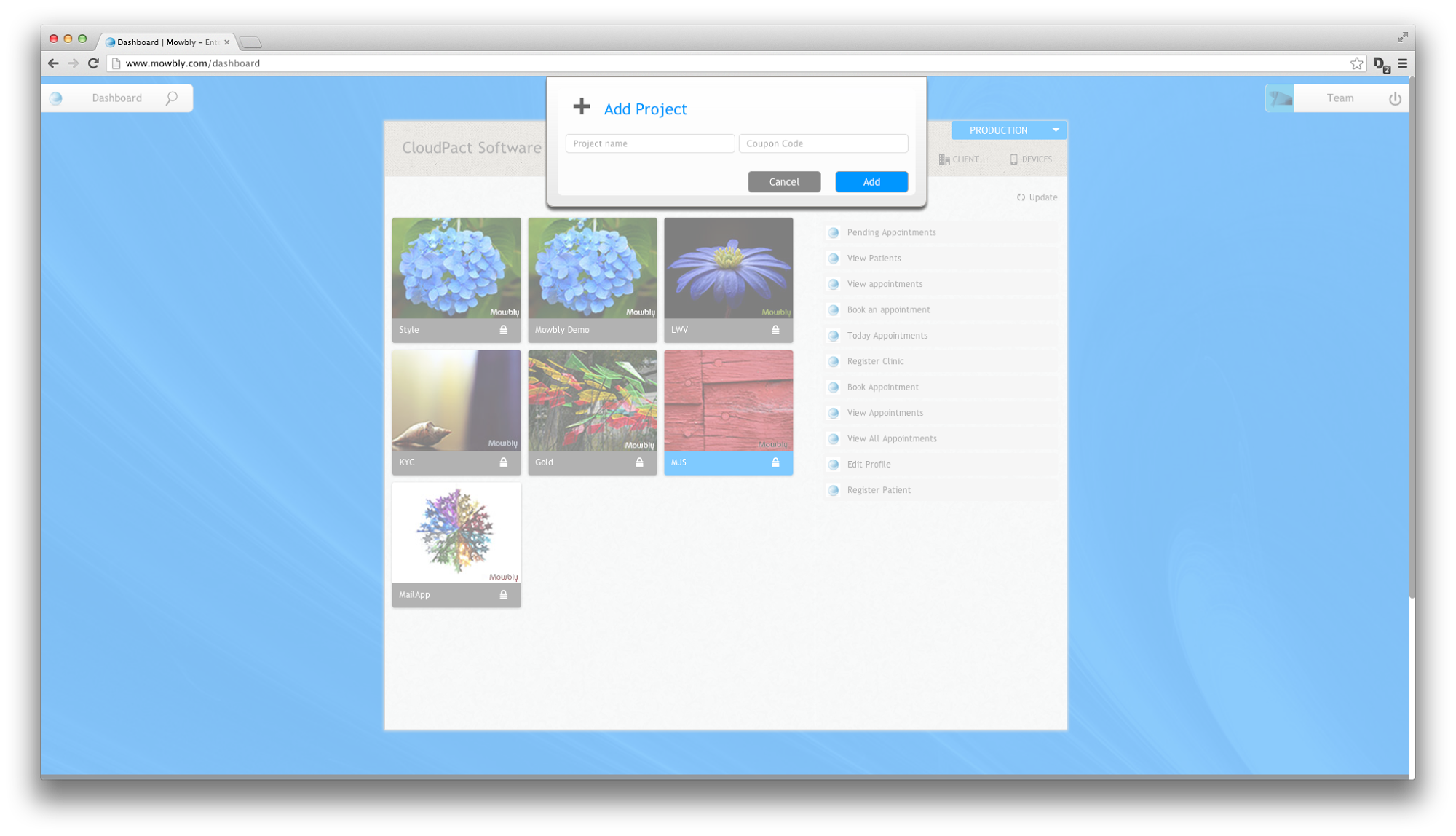
Fig 2 : Add project dialog
Deleting a project
You can delete project(s) from your space by clicking on the delete button present in the left section on the projects console. On clicking the delete button, a toast drops down which asks you to choose the projects to delete. You can choose the projects by clicking on them. The selection is indicated by blue color. Once you have selected the projects to delete, you can click on the delete button on the toast.
Note: Project deletion will delete all files and packs of the project. It also revokes the pack from any role to which the pack has been assigned.
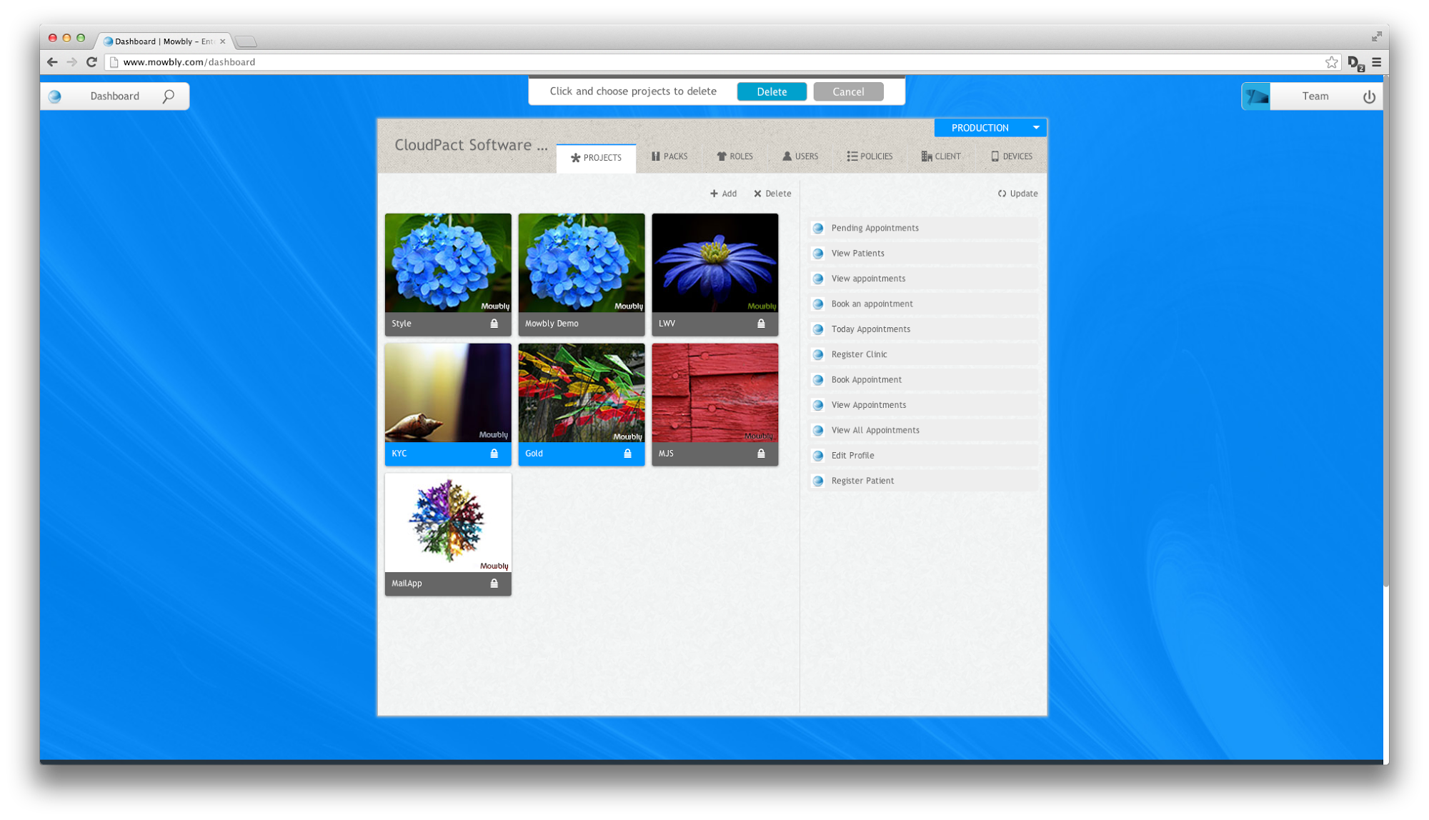
Fig 3 : Two projects selected to be deleted
Updating packs of project
You can update the packs of the projects by clicking on the update button present on the right section of the project console. On clicking the update button, a toasts drops down asking you to choose the packs to be updated. You can select the packs by clicking on them. The selected packs are indicated by blue color. After choosing the packs to be updated, click on the “update” button on the toast.
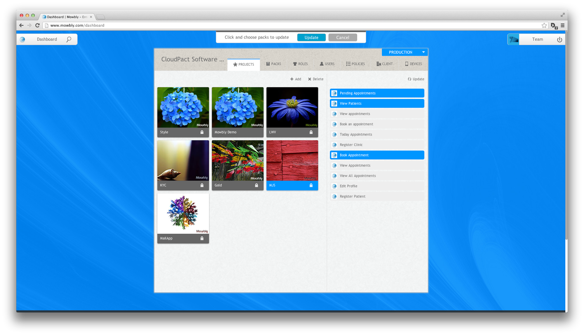
Fig 4 : Three packs selected to be updated
Project actions
On hovering over the project, you can access the following list of project specific actions:
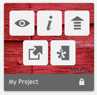
Fig 5 : Projects actions
1. Simulator
The simulator button is indicated by the icon which looks like an eye. On clicking on this icon, it opens the Mowbly simulator and previews the packs present in the project.
2. Info
The info button is indicated by the icon which looks like an “i”. On clicking on this icon, it opens the project description page where you can describe the project through a markdown.
3. Export
The export button is indicated by the icon which looks like an upward arrow. On clicking on this icon, it exports all the files of the project as a zip file which can then be used to import in another user or space.
4. IDE
The IDE button is indicated by the icon which looks like an arrow moving outside. On clicking on this icon, it opens the Mowbly IDE where you can edit the files within a project.
5. Deploy
The deploy is indicated by the icon which looks like an black and white flower. On clicking on this icon you can deploy your project from the development to test space or from the test to production space. (Note: Only admins can deploy from test to production space)